Table.ai Platform Redesign for E-Commerce
My role:
Research
Site architecture
Feature prioritization
Prototype design and iteration (user testing)
UX+UI design
QA
Table.ai | 2021-2023
Table.ai is a platform that aims to save time for brand managers by using machine learning to understand what the key drivers of performance are for e-commerce businesses, in order to quickly help brand managers prioritize their day-to-day operations as well as quickly write up business reports.
Problem
According to Business Research Insights, the global e-commerce analytics market size was USD 14.54 billion in 2021, and is projected to reach 37.79 billion in 2027
Brand managers selling on Amazon and Shopify currently need to access at least 4 different platforms in order to piece together the full picture of how their brand or product is doing, which takes up a good chunk of their day.
Even with the help of external teams putting together reports, brand managers will still put together a homebrew excel spreadsheet to track progress and usually have different spreadsheets to track keyword performance, ad campaign performance and marketing spend, P&L, etc.
Some brand managers manage several brands, and because the majority of their time is spent aggregating data, they spend the rest of their time focused on putting out fires instead of how to make their brands/products do better.
I was presented with a unique challenge upon joining. Table.ai as a company was just starting to pivot to a new target audience (from the energy sector and grocery stores to e-commerce), but did not want to lose all of the learnings from previous avenues of exploration. With causality as a core company goal, I had to identify where the user pain point aligned with Table’s unique insights and present valuable data science findings in a consumable way for non-data science people.
Solution
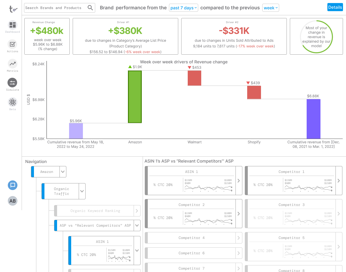
Using machine learning and AI, Table.ai empowers brand managers with an understanding of the causal drivers for their brand or product performance.
Table.ai helps brands aggregate data from various platforms and allows brand managers to triage their brand/products and prioritize their day quickly.
Research
Interviews
Conducted 5 thinking aloud shadowing user research sessions paired with an interview segment to understand existing workflows and pain points
Brand managers had to access at least 4 different platforms to determine brand and product health
Some companies hired external teams to compile the data from these different platforms
Brand managers would create their own excel spreadsheets to manually log information they cared about, but found it difficult to maintain a comprehensive list, so sometimes missed key opportunities to grow the brand/product
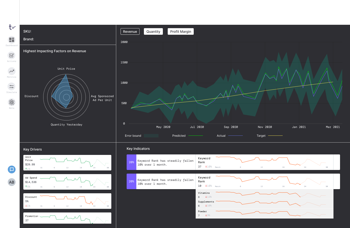
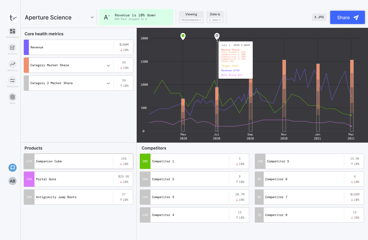
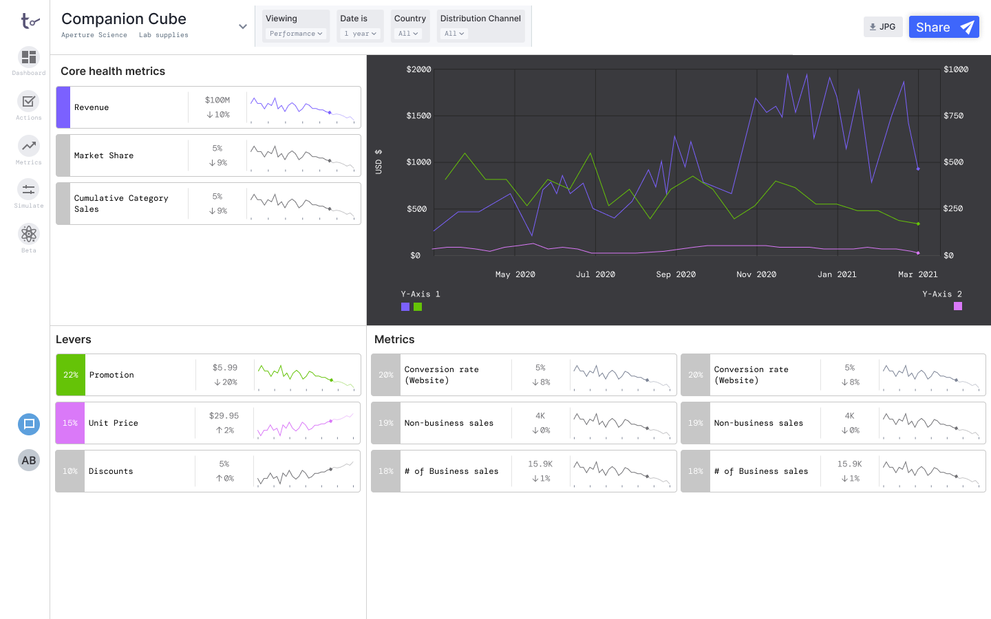
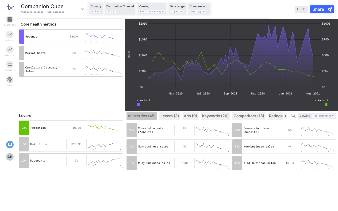
Brand managers typically think about the metrics in 3 main categories: core health metrics (like revenue and market share), levers (metrics they can modify like ad spend, unit price, discounts), and other metrics they use to validate results or to triage the root cause of a problem.
Some users manage multiple brands across 1-8 sales channels, with each channel having 20-40 campaigns, meaning they could be managing around 180 campaigns and monitoring the performance.
Competitive Analysis
We also looked at existing platforms most brand managers currently use: Helium 10, Jungle Scout, Sellerboard, Data Hawk, Sellerize, etc.
While these platforms provided brand managers with detailed information about various aspects of their business, the holistic picture is scattered across several different platforms. Inundated with data, brand managers found it hard to identify how to prioritize their time.
The data within the platforms were also presented in a way that was difficult to scan through. The default view was also not aligned with brand manager’s mental models.
Site Architecture
Prototype & Test
Screen Iterations
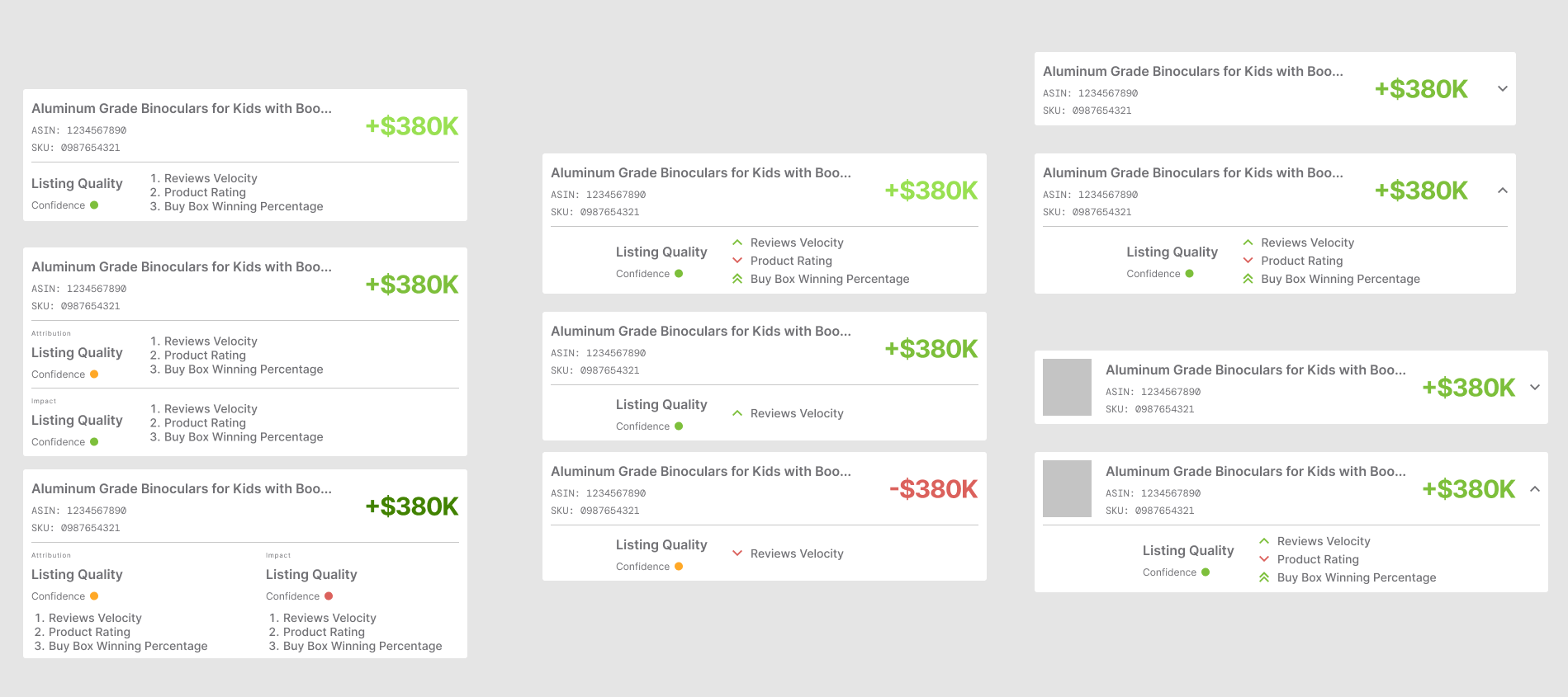
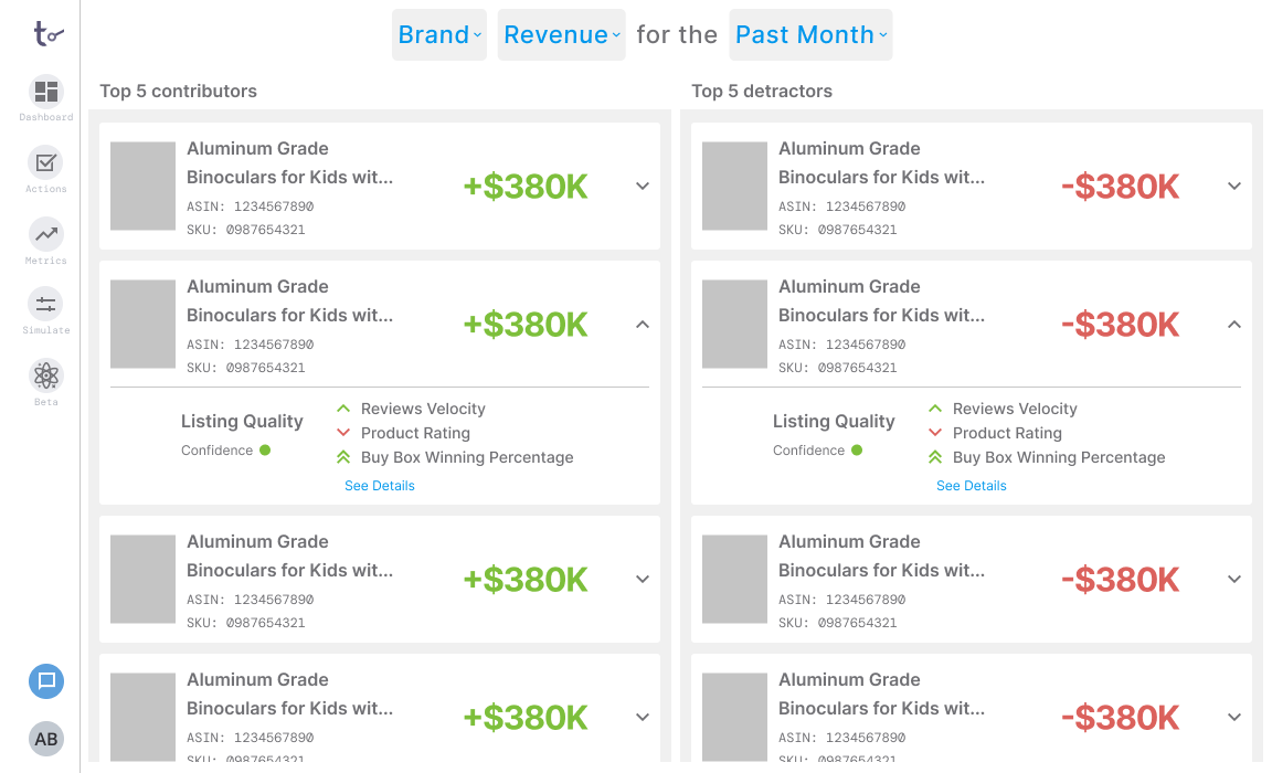
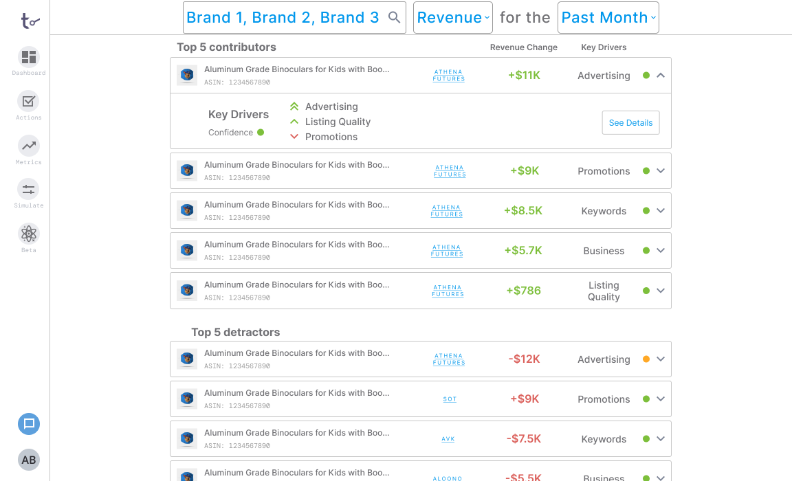
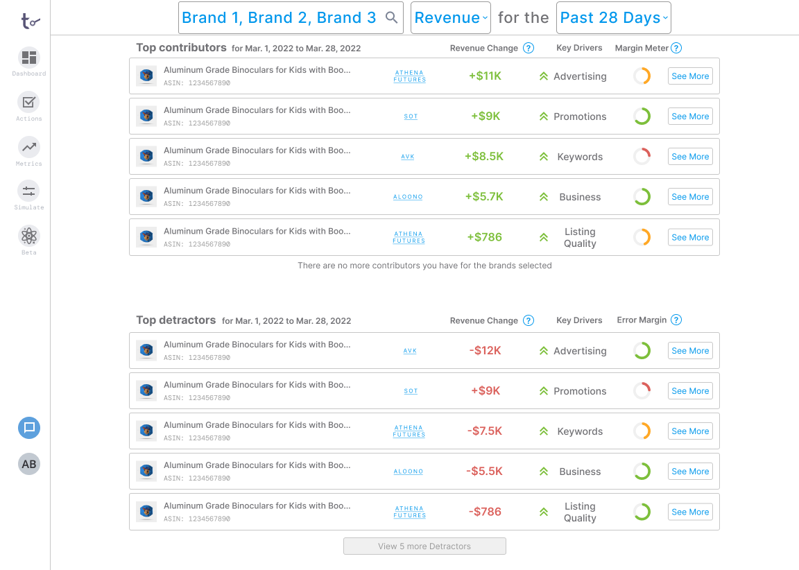
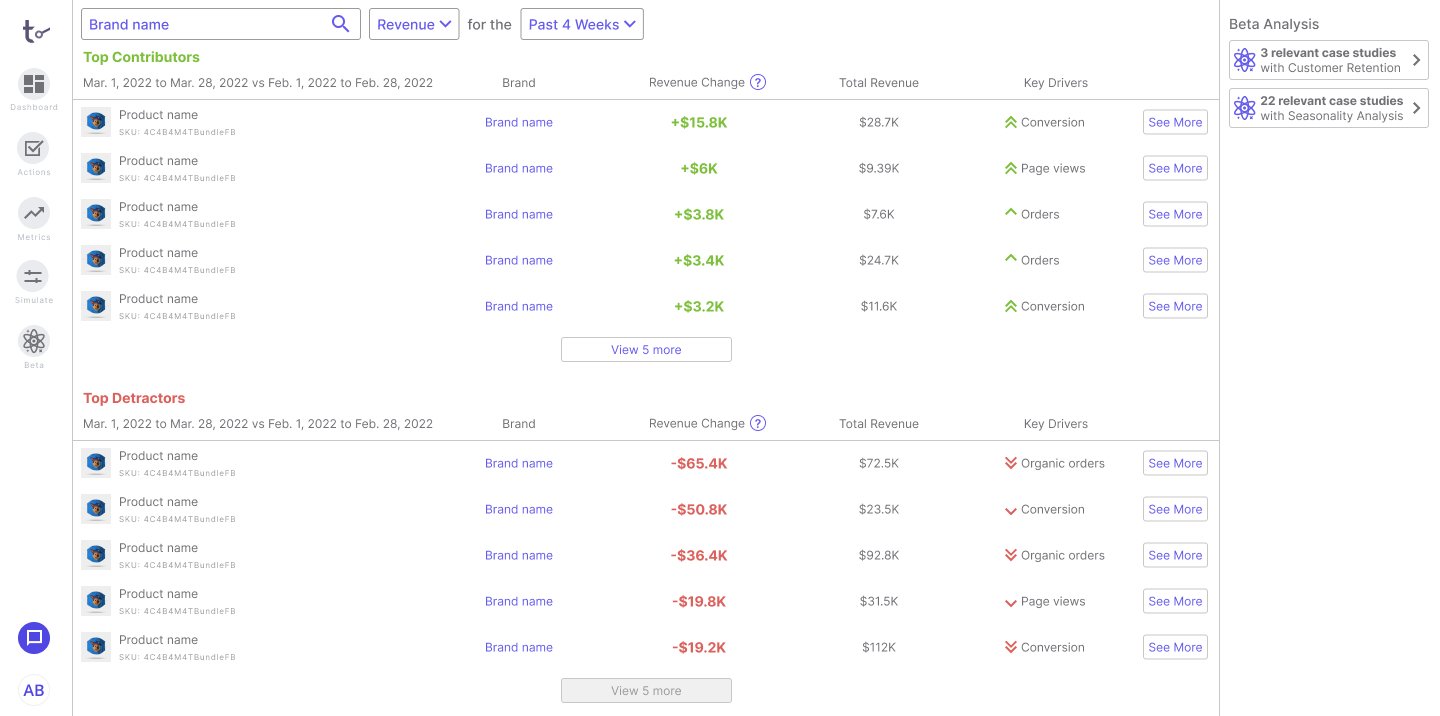
Below are examples of the several iterations Dashboard and Attribution went through after multiple rounds of user interviews and testing. I’m very happy with how far I’ve come as someone unfamiliar with UI design. As a UX designer first and foremost, I’m most comfortable during the research and UX phases of a project. At this role, I was challenged to create polished screens as well and in the iterations below, you can see the drastic improvements I went through.
Attribution was the first feature I worked on and I inherited a pre-existing design, which I slowly modified. Partway through, I decided to revamp the visual language of our platform entirely and aim for a clean, minimalistic design, which is also when I first started designing the Dashboard.
The core functionality of the platform (dashboard and attribution) took several iterations over the course of a year. For a more detailed walkthrough, please reach out to me.